Welcome

Welcome to my blog , The Hare Illustratère. I'll be posting about my art process and journey as an illustrator/author here.

Pages

Showing posts with label illustration process. Show all posts

Sunday, December 17, 2017

Lion & Mouse Illustration Process post


Ok I admit it. I've been absent from this blog. I've been busy working on a big hush hush illustration project which is finally winding down. Unfortunately, I can't share anything from it yet BUT I can share the illustration process of my personal Christmas card.

Lion & Mouse © Diana Ting Delosh
Inks on watercolor paper & Digital.
Here's the CARD
I all begins with a pencil sketch. As you can see, originally was thinking of doing some hand lettering on the top.
Lion & Mouse Pencil Sketch
 © Diana Ting Delosh
Next comes the ink. Currently I'm using a brush on watercolor paper. It gives me thicks and thins as well as various tones of blacks and texture. I feel it all adds to the illustration's energy.

Lion & Mouse Ink Line © Diana Ting Delosh
I use colored inks to paint right over my black lines. I've lengthened the lion to give myself some leeway with the final design. I will mess with background on a separate layer in Photoshop.

Lion & Mouse © Diana Ting Delosh
Colored Inks on watercolor paper
Experimenting with the background. I know I want stars and a magical quality to the sky. Time to experiment with backgrounds. The sky is actually a sky I had previously painted with colored inks on watercolor and scanned.  I like the texture of real paints on paper. The stars are drawn in digitally on their own layer. Thank Goodness for the Wacom Tablet!
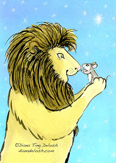
Lion & Mouse © Diana Ting Delosh
on Background-A

 Not enough oomph. It still lacks that magical quality I was after. Make the sky darker? Toss? NO! Thank goodness for layers. Just experiment with adding digital swirls and more stars and layers until... Voila! See the finished design at the beginning of this post.

Happy Holidays to ALL!

Illustration blog: dtdelosh.blogspot.com
twitter: @dtdelosh

Check out my shops:
Check out my ThumbNailer


Monday, March 7, 2016

In Case you missed it...Groundhog Waltz, Illustration Process

Just in case you missed it, over at my D2PB Group Blog, I shared my illustration process behind my Groundhog Waltz illustration.
My tools from L to R: mechanical pencil, 0.7mm HB black lead, kneaded eraser, Micron  Brush Pen, Higgins Black India Ink, brush, 00 Rapidiograph pen, Black India Rapidiograph Ink Universal waterproof for paper &; film, assorted brushes, paint palette for mixing my colored inks.
Please Click on the link to read all about it on Drawn To Picture Books: Groundhog Waltz, Illustration Process: Diana Ting ...: Here's a peek into my illustration process.

BTW: Notice the rough sketch behind my illustration implements? It's a very sneaky peek at a personal project currently on my drawing board. Sh-h-h-h.

Thursday, December 17, 2015

Little Red - Illustration Process Post

Little Red
© Diana Ting Delosh
Ink Watercolor Digital
2015 has been the year of experimenting with different mediums. To create Little Red I used  a Micron Brush Pen and assorted Rapidiographs for the finer lines on watercolor paper. The Rapidiographs are filled with Black India Rapidiograph Brand Ink: Universal 3080-F.BLA Waterproof for Paper & Film. Previously I had tried other brands of brush pens and found them not as waterproof as they claimed they were. The Microns are truly waterproof and I was able to paint right over my line art as soon as the ink was dry. I'm quite happy with the results.
Ink Line Detail for Little Red
©Diana Ting Delosh
Assorted pens
I used the Brush pen mainly on the Little Red and the Wolf as I wanted them to be the focal paint. Most of the finer details were put in with a double zero pen as well as some pencil. This way I could have my thick and thin lines and my details too. The background  forest is done in pencil as I wanted it to be very soft and fade. As you can see they were so fine they barely scanned in.

Friday, October 5, 2012

Once Upon a Midnight - Illustrated Title Type Process

One of my hush hush projects is in the final stages and with permission from the author, Kelly Morrison Handerhan, I thought I'd give you a sneak peek by showing you how I designed the illustrated title type.

I could've used type that's available on my computer for commercial usage But the title of this project is very evocative, ONCE UPON A MIDNIGHT. OOH this title is begging for some special treatment. So I begin to doodle and refine. And Hem and haw. Type Style - small caps, all caps, upper and lower case?  Should I add crows? Will they read as crows or just look like blobs?
Decided against crows - too busy. Went with All Caps as I felt the small caps had too much white space between the lines and lowercase letters didn't seem to work as well.  Refined the sketch. Enlarged sketch, transferred to paper via my lightbox and then the inking begins. I use a rapidiograph pen for inking and scan.
Voila - here it is in place on the wrap-around cover art. Once Upon a Midnight is about Andy the Pug on a midnight romp. We just loaded this book project to CreateSpace.com and we can't wait until it's in the marketplace.
Once Upon A Midnight Book Cover art for a story by Kelly Morrison Handerhan
 with cover and interior pages illustrated by Diana Ting Delosh.
Copyrighted material!!!!

For info about Andy please see www.facebook.com/andy.pug.9
You may Now order Once Upon A Midnight on Amazon

Wednesday, January 25, 2012

Dragons - 1 Sketch to Several Dragons

Dragon  Sketch - © Diana Ting Delosh

I doodled this  dragon with my trusty ball point pen during a TV commercial. The commercials and time limit provide enough distraction so I can ignore any inner critic. I find that I can get started on a few of my back burner projects this way. Helps me get more done without the burnout. This sketch then had to wait it's turn until I had time between assigned work to transfer to paper, ink and paint, but at least the sketch stage was done.

As this Dragon illustration usage was for my Year of the Dragon/Chinese New Year cards as well as a decorative motif on various products I chose not to draw/paint in a back ground. I could add these on with Photoshop, giving me more design options. Leave it plain for a decorative look -great on a T-shirt or a card. Add to the tail to make it longer to wrap around a mug for example. Plop it on a solid background for a card or even my painted starry moonlit scene for a more narrative look. 


Asian Dragon- © Diana Ting Delosh


Long Curlicue Tailed Dragon - © diana Ting Delosh

Starry Night Dragon - © Diana Ting Delosh
You can find my dragons inhabiting my shops at:

HAPPY YEAR OF THE DRAGON!
FYI the Dragon  is supposed to be the luckiest of all the 12 Chinese zodiac animals. The Chinese New Year is celebrated for 15 days. 2 weeks plus 1 day for good luck. The 2012 Dragon Year is celebrated from Jan 23rd to Feb 5th.

Thursday, September 22, 2011

The Fox and The Crow - Process

THE FOX AND THE CROW
© Diana Ting Delosh
Ink, watercolor and Photoshop

Decisions, questions and hopefully solutions are a part of my illustration process. As the above illo was my entry for a fun group project, CBIG AESOP'S FABLE Illustration Catalog, the first questions was which Fable. Easy enough something that featured things I like: animals, food, nature. Sure I could've also used this as a challenge to draw things I don't like but as I was already in the midst of juggling other deadlines why stress. I did say this was for fun.

Decisions: the angle perspective of art - lot's of doodling. Decided to keep it simple as I wanted to show the goody falling from the crows mouth  as well as her "OOPs" expression and the triumphant glee in the fox's face and body. Also needed to decide on whether I was going the traditional route and illustrate cheese as the coveted food item. Some of the versions did not specify cheese so I thought I'd have some fun with it and do one of my favorite yummies, the rainbow cookie. Now that's a treat worthy of some cunning.  Ink in the foreground, main characters and paint.

Background Quandaries: Keep it simple or do the whole forest. Usually I'm not this indecisive but this time, who knows, maybe it was the August heat. Couldn't decide and went back and forth during the sketch phase. Decided on simple and then second guessed myself by adding in the forest after I had painted the foreground. OOPS! Painted out the forest with Gouache. Just could not stop myself as I impulsively added just a few trees over to the extreme right.  Muddled it up again! My only excuse for this lapse in judgement was that I was juggling multiple projects and clearly muddle brained myself. Forgot a major rule in illustration: Keep what is important to the story in focus. Thank goodness for Photoshop. Deleted the offending background and replaced it with a sky I had painted for another project. Sigh!

And there you have it the story behind the illustration.

My Fox and Crow illustration is my entry for this years CBIG group project the CBIG AESOP'S FABLE Illustration Catalog. The pdf catalog may be viewed on the CBIG website and all 26 illustrations are showing on the CBIG blogzine from September 1st through October 31st, 2011. See my FOX AND THE CROW  - CBIG Blogzine - September 23, 2011.