Welcome

Welcome to my blog , The Hare Illustratère. I'll be posting about my art process and journey as an illustrator/author here.

Pages

Saturday, February 21, 2015

#PicturesMeanBusiness - Credit the Illustrators

Logo by Sara MacIntyre
http://jabberworks.livejournal.com/
SO what does the above title mean? or refer to? Well click on the following link and read the very thought provoking post by Sara MacIntyre: #PicturesMeanBusiness

In short, We illustrators mean business. Illustration is a real profession and our illustrations enhance and add value. Too often the author of a book is mentioned but the illustrator is not, nor the designers. BUT would that book have even been given a second glance without the addition of the illustrations or thoughtfully designed type and cover???? The #PicturesMeanBusiness tag is meant to help bring awareness to the illustrators and illustrations in the biz. The post is a call to urge recognition for our profession and credit for our hard work wherever they appear but specifically in publishing. How can the value of illustration be quantified if there is no or limited data?

Happy Year of the Sheep, Ram, Goat!

Zen Ram © Diana Ting Delosh
Ink watercolor & Photoshop
Happy Year of the Ram! 
Wishing All Good Luck, Prosperity and Happiness 
in the coming year.
Last but not least a Creative and Productive year too.

Chinese New Year began on Feb 19, 2015 and there's 15 days to celebrate the beginning of the New Year.

In case you're wondering about the indecisive nature of  the Animal of this year, it's because the Chinese word doesn't translate neatly to sheep or goat (rams are male sheep)... however I'm sure the animal in question minds. 

FYI: My Zen Ram illo may be found: 
as an Art Print  and other nifty products on society6.com/dianadelosh
on t-shirt & mugs at zazzle.com/deloshdesigns*

Tuesday, February 17, 2015

Thumbelina: Sleep - Illustration Friday

Thumbelina © Diana Ting Delosh
Ink, watercolor and Photoshop
I've been thinking that I'd like to work on a series of Fairytale inspired art for awhile but it's only recently that I've actually put pen to paper.  I like the theme of fairytales because:
• I love them
• A lot f the stories involve people and I need more of them in my portfolio
• Versatility -  can be classic or  re-imagined as modern day fantasy. Full color or black & white, for the pre-K set or even YA or even just as handlettering.

Every now and then synchronicity occurs. This year I have a chance to submit a Fairytale illustration for an upcoming  CBIG group show.  Incidentally I'm currently doing the KidLitArt Challenge #kidlitart28, 28 illos in 28 days, can be just doodles or even finished art. Which started me doodling fairytale related art amongst other things. I also participate in a weekly twitter illustration challenge #colour_collective,  based on weekly colors. Last weeks color was Powder Blue a very dreamy color. So of all my doodles I chose to work up Thumbelina. Which just happend to feature a Sleeping Baby, Perfect for Illustration Friday's current topic: SLEEP. Tah Dah - illustration challenge trifecta!

Friday, February 13, 2015

Dickens: CBIG illustration Exhibit 2015

Ghost of a Wedding Cake Art Prints  may be purchased at
Society6.com/dianadelosh

My Biro (ball point pen) Illustration, A Ghost of a Wedding Cake, Inspired by the Charles Dickens novel, Great Expectations is hanging in...

Dickens, A Celebration In Pictures
Feb 5 - 21, 2015
Poe Park Visitors Center Gallery
1640 Grand Concourse, Bronx, NY 10458
Open: Tues - Sat, 8am - 4pm 


Along with the art of my fellow CBIG  artists:
Lisa Cinelli, Diana Ting Delosh (me), Peggy Dressel, Laura Goetz, Leeza Hernandez, Sara Kahn, Doreen Marts, Donna Miskend, Marilyn Papas, Clare Pernice, Roberta Rivera, Vicky Rubin, Cheryl Taborsky, T. T. Tyler

For more info and schedule of events Please click on the following link:
CBIG EXHIBITS AND EVENTS: DICKENS TRAVELS- Dickens, A Celebration In Picture...: SCHEDULE OF EVENTS  EXHIBIT INFO DICKENS, A CELEBRATION IN PICTURES ILLUSTRATIONS BY THE CHILDREN'S BOOK ILLUSTRATORS GROUP S...

Thursday, January 22, 2015

A List and a Mind Shift


Being a freelance illustrator, or as I prefer an independent illustrator, means life doesn't always hum along smoothly. In fact it usually means life moves at a herky jerky pace. Somedays you're rushing to meet deadlines. Other days you're wearing a hole in the rug with your pacing as you wait for art directors & buyers to make a decision on your art. Then there are the lulls between jobs when you're waiting, just waiting for something to happen, checking your e-mail, phone, twitter feed anything. And yes, I believe this kind of waiting is the worst.

In a perfect world, life as an illustrator would hum along, full of wonderful, creative, well paying dream assignments, projects. And of course all your clients would give you due dates that gave you ample time and your art would be rubber stamped OK. But real life sucks. And I bet all your  deadlines, like mine, seem to clump together on the same days no matter how hard you try to schedule them. Which means you're waiting to hear back from everyone at the same time...always. In between those mad rush periods there are stretches of nothingness.

So what's the trick to keep yourself from getting too nutty?  I mean after you've gotten bored with walking in circles and starring at your in-box what's next. May I suggest a list and a mind shift?

I keep a list of back burner projects. These could be anything from messing with my new color pencils, participating in a group art challenge, to working on a picture book dummy. A trick I learned as a mom was that big projects can be broken down to it's smallest components. Keep working those small bits and eventually that picture book dummy gets done.

Now for the mind shift. Think of yourself as an Independent Creative. Freelance Artist, Independent Artist, don't they mean the same thing? Yes. Perhaps. But here's the implied difference as a freelance artist your'e looking for freelance work or looking to be hired, commissioned, assigned. You work as a freelancer. In other words looking and waiting for someone to say yes. However as an independent artist you may be looking for freelance work BUT you are also coming up with your own projects perhaps even self-publishing. You are no longer just waiting for someone to give you a project. You can come up with your own. Granted you may still be submitting that project and waiting for approval or putting it out there yourself and waiting for sales. Unfortunately the waiting part can't be helped.

So Diana, you say, noticed that your website says: Diana Ting Delosh is an illustrator/author. She creates whimsical and elegant art, independently and by assignment. Why aren't you calling yourself an independent... Well for awhile I did, but then I kept getting queries about whether I took on freelance assignments. Duh!

Thursday, January 1, 2015

Happy 2015 - Resolutions


It's that time again. Time for list making and reviewing the past year, all in hopes of making the new year a better year. So what have I resolved to do to make 2015 my best year ever or at least a better year? I won't bore you with my whole list but I will share a few that may be relevant to other illustrators, creatives and freelancers.

FINISH Things!
I seem to have ended 2014 with a slew of unfinished projects or things in need of revisions etc. Probably because in between jobs I worked on personal projects but had to put them aside until...  Now I have a lot of loose ends that need tying up and they're bugging me. So - I will continue to create furiously BUT I will do my best to finish them, beginning with those pesky projects that are haunting me.

Build up my Illustration Portfolio
There's always room for improvement. More Black & White art: line and grayscale art. People. I love drawing animals but I need more people in my portfolio.  Continue having fun with hand lettering. Lastly, experiment with a new illustration technique or two. Have fun. Keep it fresh. If you don't enjoy your art you can't expect someone else to.

4 Postcard Mailings
I've been resolving to do 3 - 4 Postcard mailings for years but last year was the first in long time that I actually did 3 mailings. One of the things I "got" in 2014 because I finally figured it out. Step 1 - Update my Master List as I go. Step 2 - Create lots of new art -so I have something to pick from when it's time to create a new promo postcard. Must create to have something to promote.

Document my creative process
In 2014 I sketched/created oodles more than in previous years but half the time I never posted/tweeted etc. about it. Unfortunately in the digital age it seems as if things only exist if you have posted tweeted or shared it digitally in some fashion. I am resolving to blog/share with purpose to get the "right" eyes on my art.

Wishing all a Happy, Creative, Productive and Prosperous New Year!


Thursday, December 25, 2014

Merry Christmas!

Merry Christmas
Peace, Comfort and Joy
to ALL this Holiday Season!

Winter Raccoon Girl
© Diana Ting Delosh
Ink Watercolor & Photoshop 
I know, I can hear you: Raccoon Girl, now that's a lame name. Agreed, but until I come up with a wonderful name that matches her character I'm referring to her as Raccoon Girl because it is so generic  and begs to be changed. Currently I've been tossing about Racquel - but Racquel Raccoon is perhaps too euphonious and then there's Rosie which is less so. Anyway stuff to mull over while I stay cosy in my winter den. Ahem, I mean studio.

Thursday, December 4, 2014

Mr. Squirrel's Apples - E Book illustrations


Mr Squirrel's Apples,
story by Olivia Grey,
Illustrated by Diana Ting Delosh,
Published by  Farfaria 2014
Click to preview a few pages of the latest e-book Mr. Squirrel's Apples that I illustrated for Farfaria. A fun math, counting, subtraction, concept story. Another fun ink , watercolor and Photoshop illustration assignment. Below are 2 illustrations from the book. They are page 4 and page 12.


Yay - I'm a 2014 PIBOIDMO Winnah!
PiBoIdMo 2014 Winner Badge - art created by the talented Vin Vogel
For taralazar.com/
Yay - I'm once again a PIBOIDMO winner - Having successfully come up with 30 Picture book ideas in the month of November. Not 30 wonderful ideas mind you. Here's the breakdown:

6 of my PB ideas concern a certain character of mine that is begging for a story. I can see this character down to her fashion tastes. I think I need to pay her some attention and hear her out.

7 of them have more then a glimmer of an idea - more heart and meat. Some of these have popped up in previous  PiBoIdMo Lists in various incarnations. Probably why they have more substance... and may be reaching critical mass... at which point I will have to do something with them.

The balance are mere titles and some very meh thoughts to fill the quota.

Not too bad. Reminds me of a photography course I took wa-a-a-a-ay back. My Photography teacher, Mr. Fox, would tell us to shoot at least 100 pictures. We would then make contact sheets of all the images. Look them over and pick 3 that we thought were worth developing into prints in the dark room. Hm-m-m so which PIBOIDMO ideas will I be developing into PB dummies over the next year?


Monday, December 1, 2014

Tom Turkey E-Book Illustrations

Written by Olivia Grey
Illustrated by Diana Ting Delosh
Performed by Melissa Trachtenberg
Published by Farfaria Fall 2013
Click on the Link to my Thanksgiving E-book, Turkey Tom  and you can turn a few pages. I had fun illustrating all of Tom Turkey's animal friends. Giving each of them distinctive head gear that reflected their character.  Below are 2 of my illustrations from the story.

 
They are respectively page 1 and page 4.


Saturday, November 1, 2014

PIBOIDMo 2014!

It's November and it's time for Tara Lazar's Picture Book Idea Month. It's become an annual tradition for me. Some years I'm better at it than others. Hopefully this will be a good year...at least I signed up early and I'm thinking PB ideas on Nov 1 vs on the 25th like last year. Not that November is the only time to think Picture Book Ideas but having a dedicated time to think them up helps to capture them. It's like having a deadline to do something vs saying whenever. I don't know about you but I'm more likely to come up with something tangible when given a deadline vs being told whenever. Unfortunately whenever never seems to come around.

Yes -I solemnly swear to come up with 30 Picture book Ideas in 30 days in the month of November 2014! 

Over the years I've tried different methods of logging in my ideas: dedicated book, Random scraps, index cards, Looseleaf binders... What seems to work the best for me is writing them down mainly on pre-numbered index cards, you never know when inspiration will strike, and pop them in a box. Makes it simple for me to go thru when I want to start another Picture book manuscript/dummy. Although most times I work with whatever haunts me.

Picture Book Illustrators/writers who want to join in the fun- just go to Tara's Blog and sign-up for PiBoIdMo by November 7th... or just read her blog at TaraLazar.com and get inspired.

Monday, September 1, 2014

Last Hurrah for Summer!

HAPPY LABOR DAY!
Elephant Beach © Diana Ting Delosh
Ink & Watercolor Photoshop
Art was created for the 2014 NJ SCBWI June Conference Illustration Gallery. The exhibit theme was "Down by the Shore". And Yes I still plan on writing about my conference experience... some day soon... hopefully before winter.

 
Heres to 1 last Hurrah for summer! 

I don't know about you but I had 1 of those summers. Typical really, you know, in early June you have all these visions of what you think you will be doing for the summer and then life happens and before you know it -It's Labor Day and it's all over.

Not really of course. It's now just fall and your list is still there and growing as fast as you can subtract from it.

Tuesday, August 26, 2014

GTS 2014: Mini-Terrarium Wall Art

TAh Dah -drum roll please... here's my take on mini-terrariums... FLOURISH
Flourish © Diana Ting Delosh 2014
Ink, Watercolor and Photoshop
The brief for round 1 of Lilla Rogers' Global Talent Search was to create Mini- Terrarium themed wall art and type was a requisite.  My process begins with doodling. To come up with a phrase or word, I jotted phrases that came to mind in my sketchbook, my journal on the edges of job scraps, napkins, etc. I began with a large terrarium image focus and phrases like: Small World. As the doodles progressed I found the foliage kept growing out of my container and sayings like Grow Where You're Planted or Get Out of Your Comfort Zone or Grow Wild came forth. Could I distill that essence into 1 word?? 
Flourish Sketch © Diana Ting Delosh 2014
The sketch only hints at whats to come.
Finally came up with FLOURISH, a word with a lot of meanings. It could mean thrive or to brandish something like a sword or  to embellish. My concept was of a delicate plant growing inside the mason jar, bursting out of the confines of the safe jar to be this wild, slightly chaotic plant with big showy blooms.
Mini Terrarium Plant - Ink  © Diana Ting Delosh 2014
Note after I painted the lines I decided the composition was too tame . The plant needed to be growing off the page.
The actual art was created as 3 separate pieces: the mini-terrarium, the Flourish hand lettering and watercolor background wash.  Put together all in Photoshop. Couldn't decide if the type should be bigger or smaller and in the end went with the smaller type version. Only to hit submit and decide a second later that I preferred the bigger type layout as in the original sketch  - oh well.

Incidentally, the GTS 2014 Gallery is Live -Click here to see ALL 999 Entries. My Entry is on page 13, mid-way down the 1st row smack in the middle of amazing gorgeousness. And in case you were wondering -Nah, I'm not 1 of the 50 semi-finalists.

Tuesday, August 19, 2014

Global Talent Search 2014 Competition!

Lilla Rogers Global Talent Search  2014
I've officially thrown my art into the ring - Hoping to be 1 of the 50 semi-finalists in Lilla Rogers' 2014 Global Talent Search Compettiton.  There are 999 entries in the 1st round. so - if my math is correct, that means if you're selected as a semifinalist that means you're amongst the top 5% of really amazing illustrators. Needless to say the competition is fierce!

The brief for round 1: create a piece of wall art - theme of mini-terrariums. Piece Must include type - may be hand lettered. Any medium allowed. Art Size : 7 x 9". Presentation size: 8 x 10". We all received our brief on August 4th and the deadline was August 18th, 12 noon EST about 2 weeks to create wonderfullness.

I am so glad that the brief for the first round was something that I have an affinity for. Loved the idea of mini- terrariums and plant images that this brief conjured up. The only bugaboo was the type /lettering part. Not the act of hand lettering mind you but deciding what the word or words will be. Found this part the most vexing.

Sorry but I can't show my piece publicly until the GTS 2014 Gallery opens show casing all 999 illustrations. Which will be I assume before the 50 shortlisted artists will be announced on Tuesday Aug 26th. That's in a week! OR Perhaps it'll go public on the 26th -not really sure as the GTS crew have their work cut out for them posting all 999 illos in the gallery.  EEEEEE!!!! Very excited! I've got all my digits crossed.

Saturday, July 26, 2014

MATS - JULY - Beverage, Personal Art

I confess I couldn't wait for the assignment -maybe than we could share like usual. But the assignment was Personal Beverage Art.  And we were asked to continue not sharing so we could arrive at our personal art pieces without undue influence from fellow mates. No sharing until the July Gallery went live on July 22, 2014. Hint hint I'm on page 2.

BUT what is personal art to me? I have used the term Personal art/illo/project to refer to uncomissioned work. Self-started art created with the end purpose of submitting to editors/art directors or pumping up my portfolio or making into product/content for my POD shops. Nothing wrong with all that but was that really personal??? Yes personal  as there is only my self-imposed deadline but not really personal as I'm still hoping someone other than moi likes it.  In it's purest form I believe it should mean - art that I do just for me. Could be experimental - something I might hang up on my wall or not. Something I rarely do - but now I have this assignment... And Now for something Totally Different!
ICE CREAM SODA © 2014 Diana Ting Delosh
watercolor
Look Mom no lines! Yup - decided to be bold and daring - no sketch -no ink line - just start painting fast and furiously. Originally I had intended to do ink on an overlay and than combine with the painting in photoshop But I decided I liked it as is. Do you? I really wanted to ask my Camp mates their opinion.

I decided on ice  cream soda because it was 90º and it had the most color potential of all my 7 beverage warm -up art. And also because Ice cream sodas remind me of my mom.  See previous post, MATS - July Warm up - Beverages to see my 7 warm-ups for his assignment.


MATS -July Warm Up - Beverages

The final month of Lilla Rogers Make Art That Sells Boot Camp was structured differently from all the previous months. As usual we got the mini first with no hint of an assignment. Draw, sketch, paint, whatever 7 beverages - from life - in any medium, try discarded surfaces etc. BUT unlike all the previous months we were NOT Allowed to Share our creations. EEK! Was Lilla preparing us for life after Bootcamp? And Now that the July Gallery has gone live...
1 - French Tea -© Diana Ting Delosh
ball point pen in my journal
2-Morning cup of Tea © Diana Ting Delosh
3 Rapidiograph Pen on paint test scrap

3- Mike's Lemonade Sketch - © Diana Ting Delosh -  fat marker on the paper towel I used to dab my brush with and clean up my paint wells with. Loved the way how the marker bled on the crumpled toweling.
 4 - Glass of water - © Diana Ting Delosh -  fat marker on the paper towel that I use to blot my inks and paint.
 5- © Diana Ting Delosh -  fat marker on the paper towel blotter.
6- Ice creamed Coffee - © Diana Ting Delosh - Pen  sketch in sketch book
7- Mom's Ice Cream Soda - © Diana Ting Delosh -  pen sketch in sketch book


Tuesday, May 27, 2014

MATS -May Boot Camp Gallery

Come one come all the May Make Art That Sells, Boot Camp Gallery is  now Open for  your viewing pleasure.  Take a gander at all the wonderful editorial illustrations on Meditation. Can you find mine in the midst of 7 pages of gorgeousness? Hint, hint, mine is on page 2, dianadelosh.  To visit the Gallery Click HERE. Enjoy!

To read more about  my Meditation Illustration process please read my previous blog post.

Saturday, May 24, 2014

MATS - May Editorial Meditation

Not Meditating © Diana Ting Delosh 5/22/14
ink, watercolor, Photoshop
The May assignment for Lilla Rogers' Make Art That Sells (MATS) Boot Camp was to create an editorial illustration for an article, How to meditate: A Primer For People Who Don't Like to Meditate by Grace Suh. Hence why my meditating lady has one eye sneaking a peek. She's just a wee bit distracted by her  thoughts. 

I was really excited about doing an editorial illustration in my own style. The MATS way: begin by non-threatening doodling. Continue doodling until you're nice and loose and ready to tackle anything. In doodling you find your own way to do the assignment. (My Face warm up sketches are in the previous post.) Read the article and sketch your concept. Very Zen.
40 - Not Meditating Sketch © Diana Ting Delosh 5/12/14
Ball point pen
This assignment felt like it was on familiar ground. My first out of college illustration assignment was an editorial illustration. I had landed it by happy accident as at the time I had one of those dreadful just out of school, everything and the kitchen sink portfolios. You would have thought after that bit of luck that I would've focused my portfolio on editorial art. But NO. I veered towards kid publishing and greeting cards. Partly because editorial illustration seemed to favor very graphic conceptual art and my assignment seemed to be an anomaly. Fast forward to the present:  Lilla showed samples of editorial illustrations that were not created in that ultra clean graphic style and made me realize that there was a place for my art in that market. In fact that's what's so great about MATS every assignment to date has shown me a different market and how I can apply my art/style to it. Pretty happy with my finished illo and added it to my Editorial portfolio.  Now just need to create more editorial illustration samples as I'm really excited about this potential market.

40 refers to my personal challenge, 365 Drawings 2014.

Friday, May 23, 2014

MATS - May - Faces

Make Art That Sells, MATS BootCamp is back from April break... and on the 1st monday of May, we got our mini assignment - FACES! This is a biggie - being able to illustrate people in your own fashion is important as it opens up more markets for your art.
36 - Doll Doodles © Diana Ting Delosh 5/7/14
Lilla suggests we  doodle from dolls as they have already been simplified/stylized and like photos they don't move. I'm not having an easy time doodling doll heads. I'm one of those people that find dolls a wee bit creepy.  In fact there are a whole slew of sketches that I'm not showing because they are really, really bad. No idea what the actual assignment will be yet. I suspect since Lilla mainly showed us Adult Doll images that it will be an assignment involving adults. Guessing not kids books.

37 - Three Dolly Girls Sketches © Diana Ting Delosh 5/8/14

Looked around for more Doll images and came across these friendly cloth dolls. Find these don't have the creep factor and I'm able to loosen up and enjoy the process.
38 - More Dolls Sketches © Diana Ting Delosh 5/8/14
Think I'm "getting this warm-up"  - Finally!  I'm starting to see how sketching dolls can lead to your own style of drawing people. Yup! Happy with it.

39 - dolls/Kids sketches © Diana Ting Delosh 5/8/14
Now I do draw people but I prefer drawing animals. As can be seen by my website, dianadelosh.com: 57 illustrations in the Animal portfolio while my People portfolio only has 16. Granted I could probably cull some of the animal illos  but the People portfolio could use some beefing up. So here's to doing loads more people illos and snagging more illustration commissions.

In case you were wondering, the  MAY MATS Assignment is to do an Editorial Illustration. It's actually already done as the deadline is May 25th but I will blog about the illustration process in the next post.

Numbers: 36 -39 refers to my personal challenge, 365 Drawings 2014. 

Friday, May 16, 2014

365 Drawings 2014 - Gelatin, kettles , Apple

Catching up on a backlog of 365 drawing posts. Realized that it's already mid-may and I never posted my drawings from March! So here they are, better late than never.

32 - Gelatin molds and Gelatin see March MATS Jelée post.
© Diana Ting Delosh 3//414
Red ball point pen

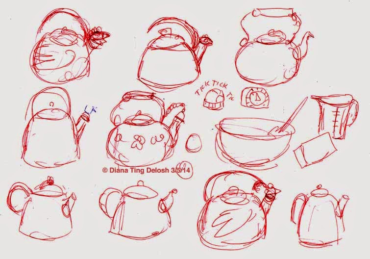
33 - Tea Kettles
© Diana Ting Delosh 3/5/14
Red ball point pen

34 - Golden Delicious Apple
© Diana Ting Delosh 3/12/14
colored pencil