Welcome

Welcome to my blog , The Hare Illustratère. I'll be posting about my art process and journey as an illustrator/author here.

Pages

Friday, July 12, 2013

The Happy Birthday Book & Three Blind Mice

I'm happy to belatedly announce that  2 e-book apps that I illustrated have been published by Farfaria

The Happy Birthday Book E-Book App written by Olivia Grey came out in April 2013. There are many ways to say happy birthday.  On each page of this book is a different country and how they say Happy birthday in that country. I chose to illustrate this book by picking a different animal to represent each country and wherever possible to show the special way that country celebrates birthdays. I was surprised to discover that some countries traditionally did not acknowledge individual birthdays but now have adopted many of our birthday customs.
The Happy Birthday Book
cover art
On page 4, for the country, China -  I chose to illustrate a Panda Bear standing in front of a bamboo forest, holding a plate piled high with the traditional chinese peach shaped birthday buns. The steamed buns are filled with sweet black bean paste - yum.
Page 4 - China
Three Blind Mice e-book app written by John W. Ivimey and illustrated by moi, Diana Ting Delosh was published by Farfaria in June 2013. Actually the art for this book was inked and watercolored in 2012, my Mother Goose year.
Three Blind Mice
book cover
 This is the complete tale of the Three Blind Mice, from the day they walk out of their front door on the search for adventure to the ill- fated meeting with the Farmer's wife and her kitchen knife and afterwards. Yes , there is a happy ending for the mice after all.
Page1

Friday, April 26, 2013

The Next Big Thing!

The Next Big Thing! Is a blog tour that gives authors and illustrators a chance to share their work, and then tag others to share theirs.  Each blogger answers the same ten questions. The tour started in Australia, and has spread worldwide.  I was ‘tagged’ by the wonderful illustrator, Nancy Donniger that I met through the CBIG.  Please check out her blog, http://www.donigerillustration.com/blog.  Her Next Big Thing! post is about her book, Lemonade: and Other Poems Squeezed from a Single Wordwritten by Bob Raczka that has recently come out in paperback. She painted the illustrations with black ink and wash accented with red watercolor wash.  At the end of this post, I will tag Children’s Book Illustrators/Writers: Ginger Nielson and Barbara DiLorenzo for your next stops on the tour.  And now, my answers to the ten questions!

1) What is the working title of your next book?
I am currently working on my picture book dummy, Robin.


2) Where did the idea come from for the book?

A few summers ago, my hubbie and I noticed a a robin fledgling with a hurt wing in our backyard. We watched it as it grew chubbier and hoped that the wing would heal naturally. After each summer storm we would look for the fledgling and usually we found it hopping and pecking underneath the azaleas. I was getting very attached to my baby bird. Unfortunately, towards the end of that summer we had a really nasty storm and the fledgling didn't make it. Cruel nature. My Robin story is my alternate ending to that summer.


3) What genre does your book fall under?
Fiction, picture book, animals.

4) What actors would you choose to play the part of your characters in a movie rendition?

Actors for Voices: Someone young, not bratty voice that embodies the curious, smart, optimistic nature of Robin.

5) What is the one-sentence synopsis of your book?

A young bird can't fly but figures out how to thrive and survive without flying south for the winter.

6) Who is publishing your book?

No one, yet. This is my current Work-in Progress, a story that I'm writing and illustrating. I am still working on the dummy art and tweaking the story. Currently the dummy consists of 2 finished illustrations and the rest are sketches. I'd like to have at least 2 more finished illustrations in it before it starts officially making the rounds.


7) How long did it take you to write and illustrate the first draft of the story?

Hard to say as it's been worked on between paying assignments and other projects - I'd say a few months - including incubation periods. My process involves switching between writing  and doodling, than revising and sketches etc. 


8) What other books would you compare this story to within your genre?

I googled picture books with disabled main characters and most seemed to be about people with disabilities.  Main characters that are different just seemed too broad a category. Then I came across my kid's favorite book as a child, Leo the Lop by Stephen Cosgrove illustrated by Robin James, about a rabbit with extra long ears.

9) Who or what inspired you to write this book?

The original Robin. I've got a soft spot for underdogs. Please see my answer to question #2

10) What else about the book project might pique the reader's interest?

I'm hoping my ink & watercolor illustrations.


Next stops on this tour are:

Ginger Nielson
gingerpixels.blogspot.com

Saturday, March 30, 2013

Hoppy Easter

© Diana Ting Delosh
This ink & watercolor illo was originally created for the Year of the Hare but I think this white hare holding a magnolia branch as a staff can double as a Easter rabbit.
Wishing everyone a Happy Easter and  much spring hoppiness.

Wednesday, March 6, 2013

CAKE+HAT Twoodle

CAKE + HAT - Pen sketch © Diana Ting Delosh

Estella thought her latest creation, the Gateaux-Chapeau was the best thing since sliced bread. (Please excuse her french.) She was sure all eyes would be on her at the spring parade. Best of all, if she got a bit hungry while strutting in the parade she could always have a quick nibble. 
The 2 Twoodle words supplied this week as the inspiration behind the above Tweet/Doodle are:
CAKE by moi. Please follow @dtdelosh
HAT by the amazing illustrator, Anita Solver . Please follow @solver

So what the heck am I chatting about???? Well it's an illustrators weekly game on wednesday. Please read the previous post. If you're on twitter search #Twoodle and see some very amusing and amazing illos and of course join in the fun.

Wednesday, February 27, 2013

#Twoodle - Carrot+Custard

Bunny has made a big bowl of her fave dessert - carrot custard. She can't wait to dig in. M-m-m-m-m.
This is an quick pen sketch digitally colored in Photoshop. © Diana Ting Delosh
Here's my 1st Twoodle using the words; CARROT @DiandraMae and CUSTARD @johnlechner.

So what's a twoodle? A twoodle is a tweet/doodle. More specifically it's a fun Twitter activity started by the illustrator, Alicia Padron last wednesday. Please read more HERE to find out more and to particpate. And if you're on Twitter please go to #Twoodle to see all the wonderful twoodles being posted today.

So what's the purpose - none other then the best reason - for fun.


Monday, December 31, 2012

2013 New Year - new possibilities

Here I sit with my brand new wall and weekly  calendars, happily anticipating the future that the pages represent. The possibilities of what's to come and what I can accomplish in 2013. Which brings me to that annual tradition of making goals and resolutions. And yes there is a difference between goals and resolutions. Goals are where you want to be by the end of the year. Resolutions are HOW you plan to achieve your goals. 
2013 Animal Fair Calendar
2013 Animal Fair Calendar by deloshdesigns
Look at other Animals Calendars at zazzle.com

The problem with goals is that if your's are like mine: make gazillion dollars or get a big fat contract with dream client, unfortunately reaching said goal is not 100% within your control. You can not wish it to come true. Sadly other parties have a big say in whether you get that dream assignment so you make mucho bucks etc. Goals are only your north star. Something to focus on so you don't get lost.

Resolutions on the other hand, are something you have control over. Here are mine for 2013:
• Create 10 pitch-ready projects
• Pitch/Submit to 10 different places
• Send out 6 promo-postcard mailings
• Create Seasonal products for my POD stores 2 - 3 months ahead
• Series of Grimm's fairytale inspired illos
• Illustrated type -perhaps a series of sayings or famous quotes
I could go on and on but I think that's plenty to work on as well as plenty of fodder for future blog posts.

Wednesday, December 26, 2012

IF GLOW & Mother Goose Re-imagined Exhibit

This is going to be a dual purpose post. Firstly - here's my illo for this weeks IllustrationFriday prompt - GLOW. Secondly - I am currently in a CBIG group show - Mother Goose Re-Imagined at the Flinn Gallery in Greenwich CT. The show runs from December 6th to January 16th 2013. Twinkle Twinkle Elephant Star also happens to be one of the 3 illos I have on exhibit.

Twinkle Twinkle Elephant Star
© Diana Ting Delosh
Ink & Watercolor

Elephant and bird stroll on the savanna at night. Guided only by the glow of their candles and one twinkling little star. The ideal of this illustration was inspired by the Mother Goose rhyme, Twinkle Twinkle Little Star and my desire to do an elephant. It was created from sketch to finish during the 13 day power outage caused by Super Storm Sandy.

3 Bold Mice
© Diana Ting Delosh
Ink & Watercolor
Three bold mice see how they sing! This illo was created inspite of the original Mother Goose rhyme, Three Blind Mice wherein the poor mice are blinded by brambles, driven crazy by their misfortunes, and had their tails cut off by the farmer's wife. By the way, notice how bright this piece is? Well this was the first piece I painted after the power came back. Tah Dah... and behold there was light and much rejoicing! 

Peter Peter Pumpkin Eater
© Diana Ting Delosh
Ink & Watercolor
And finally my third piece, Peter Peter Pumpkin Eater was created last spring. I had previously blogged about the work in progress.

Friday, December 21, 2012

Hoppy Holidays!

Ugly Christmas sweater Bunny
© Diana Ting Delosh
Ink & Watercolor illustration
Wishing All Much Hoppiness!

Friday, November 30, 2012

PiBoIdMo 2012 - better late then never

YUP I'm a PIBOIDMO-er again. 30 picture book Ideas in the 30 days of November. As this is my third year doing this challenge begun by Tara Lazar I had been looking forward to it since October. In fact I signed-up for it almost as soon as you could this year. And then didn't do much about it assuming I had time to gather my index cards and write a blog post on it etc. Then Sandy hit on monday, Oct 29th and I lost power for 13 days which taught me a few things about my creative process.

Ok OK  - I know you don't need electricity to think or write down your ideas on index cards etc. And sure I even got to read an inspirational post or 2 on PIBOIDMO when I was at a lucky friend 's home with a generator. So why couldn't I even gather my index cards and a pen and just begin? I mean I wasn't one of the unfortunates that was totally displaced. I was just inconvenienced and uncomfortable for 13 days.

Apparently my muse decided to go on vacation to a more convenient and warmer locale. It seems I needed to not be worried to be creative. Whether it be about my cat's meds going bad along with the food Or if I could gas up so I could get to my friend's. We won't even get into my fear of not meeting deadlines. There was also the shortage of available daylight hours.  Showed me how much my strategy for getting things done depended on electricity. This is not to say I got nothing done. I was able to do the traditional watercoloring part of an illustration job and a new piece from sketch to finished art for an upcoming group show.  However the difference is that both these concepts had been thought out before and PIBOIDMO was challenging me to come up with concepts. Apparently until I got my power back, I couldn't relax enough to let my mind wander off and come back with good or bad ideas. I was stuck in the here and now with no time leftover for daydreaming.


Glad to report that on the last and 30th day of PIBOIDMO I finally caught up and completed the challenge. YAY - I have 31 ideas and who knows how many more I'll have before the day is up. True most of them are plain silly but they all still count. By the way, I'm already looking forward to next year.

Saturday, November 17, 2012

Published - Farmer's Field of Gold

  
Cover and Page 9 illustrations by Diana Ting Delosh
- The Farmer's Field of Gold

© Farfaria
I'm happy to announce that another of my illustration project from last spring has now been published. THE FARMER'S FIELD OF GOLD, written by Brett Hendricks and illustrated by yours truly, has been released by Farfaria as a book app for the I-Pad.

Friday, October 5, 2012

Once Upon a Midnight - Illustrated Title Type Process

One of my hush hush projects is in the final stages and with permission from the author, Kelly Morrison Handerhan, I thought I'd give you a sneak peek by showing you how I designed the illustrated title type.

I could've used type that's available on my computer for commercial usage But the title of this project is very evocative, ONCE UPON A MIDNIGHT. OOH this title is begging for some special treatment. So I begin to doodle and refine. And Hem and haw. Type Style - small caps, all caps, upper and lower case?  Should I add crows? Will they read as crows or just look like blobs?
Decided against crows - too busy. Went with All Caps as I felt the small caps had too much white space between the lines and lowercase letters didn't seem to work as well.  Refined the sketch. Enlarged sketch, transferred to paper via my lightbox and then the inking begins. I use a rapidiograph pen for inking and scan.
Voila - here it is in place on the wrap-around cover art. Once Upon a Midnight is about Andy the Pug on a midnight romp. We just loaded this book project to CreateSpace.com and we can't wait until it's in the marketplace.
Once Upon A Midnight Book Cover art for a story by Kelly Morrison Handerhan
 with cover and interior pages illustrated by Diana Ting Delosh.
Copyrighted material!!!!

For info about Andy please see www.facebook.com/andy.pug.9
You may Now order Once Upon A Midnight on Amazon

Tuesday, September 18, 2012

Moon Dancing Bunnies win Design of the Day!


Turned on the computer this morning to the lovely news that my latest design, Mid Autumn Moon Festival Dancing Bunnies card was awarded the Design of the Day by Greeting Card Universe. YAY! I think I'll do a hoppy dance myself. Thanks GCU!

For this design, I have a group of rabbits doing a hoppy dance under a very full autumnal moon. The moon is a pale yellow to balance against the pale to medium browns of the hares. The art is created with ink, watercolor and Photoshop.  I don't know if real rabbits dance in the moonlight but I do see more of them on moon lit nights.

The Harvest Moon Festival is a Chinese holiday celebrated on the fullest moon of the year in September or October. Sometimes the moon even has a golden autumn glow to it. Rabbits in Chinese mythology are associated with the moon. Sometimes the hare is is said to be living on the moon under a tree, where he must make medicine for the princess that also lives on the moon. Sometimes he is shown pounding medicine with his mortar and pestle. In other stories the hare lives on the earth and gazes up at the moon where the princess lives. It is celebrated today by eating moon cakes and visiting family.

FYI - the Autumn Moon Festival or just Harvest Moon festival is celebrated this year on September 30th on the full moon of course. If you want to see the inside of the card or to purchase please just click on the card image. If you want to see my other card designs go to gcuniverse.com/DianasCards

Saturday, September 8, 2012

Children's Literary Salon in Retrospect: Illustration on June 2, 2012 | The New York Public Library

Earlier this summer I and my fellow CBIG officers were panelists at the New York Public Library, speaking about what we love: illustration and the Childrens' Book Illustrators Group. Read all about it in this nifty article!

Children's Literary Salon in Retrospect: Illustration on June 2, 2012 | The New York Public Library

Tuesday, September 4, 2012

A Ghost of a Wedding Cake

A Ghost of a Wedding Cake
© Diana Ting Delosh
Black Medium Point Bic® Pen
 
Miss Havisham's wedding cake has been standing as it was the day she was jilted. Over the years the frosting has hardened and now the cake is inhabited by spiders, centipedes, noseeums, rats, ants and is festooned in cobwebs and dead roses. A ghost of a wedding cake for a ghost of  bride. This illustration is inspired by the Charles Dickens novel, Great Expectations.

Something about Dickens made me think of doing a black and white illo. Originally I thought of using my trusty double zero rapidiograph pen to ink and brush on a wash but then I thought how well a ball point pen could do whisper thin lines -great for cobwebs. That clinched it. I decided to use a Black Medium Point Bic® Pen as my medium. I frequently use ball point pens to sketch with as they're just so handy and flexible. Depending on your pressure and the tooth of the paper you can get a variety of strokes from barely there to bold black. However using this as my medium on a Finished piece of art required me to shift my perspective on this everyday tool. I mean was it really OK? Sure it was fine for impromptu sketches but serious, planned, finished art? Sure, I mean why not? What do you think?

The above illo is in the CBIG Illustration Exhibit, A Celebration of Dickens in Pictures at the Yonkers Riverfront Library Gallery. The show will run from August 25th to October 31st, 2012.  The artists reception will be on September 13th. For a complete schedule of events for this show please visit cbig-nycexhibits.blogspot.com/ .

If you can't make it to the show my fellow exhibitors and I  will also be posting the art over on cbig-nyc.blogspot.com during the run of the show.


Sunday, August 5, 2012

IF: BOUNCE!

Dancing Bunnies
ink and watercolor
© Diana Ting Delosh
Dancing bunnies don't just hop
They stand on their toes and twirl, twirl, twirl.
And If they fall they Bounce right back.

Here's my entry for the illustrationfriday.com weekly illo prompt.

Here's to bouncing back from all the missteps and mishaps that life throws at us.

Sunday, July 22, 2012

PumpkinEater Promo Postcard

July2012 Postcard front & Back
Art on Front is © Diana Ting Delosh
Art on Back is from An Armful of Acorns © Farfaria
NOTE: I've smudged out some info out of privacy concerns
  
Opted to try the BIG postcard size for my latest postcard campaign. From what I have read on various sites and have heard from other illustrators/art directors and editors - the Big size stands out amongst all the postcards they receive. At almost double the size of the standard size postcard it had better.  They're just shy of 5.5 x 8.5 inches.

I had these printed via VistaPrint.com and as they were running a sale - even printing in color on both sides did not bust my budget. I must say I'm really pleased with how bright and vivid the colors are. Now postage of course is the 1st class rate so that did tack a bit more to the price. Is it worth it? I hope so, however as I just mailed these out it's too early to say. I am keeping my fingers crossed that they get noticed and pinned to that coveted bulletin board. I can even dream that they lead to an actual assignment.

Any other news? Well lots but unfortunately it's all still hush hush.

Tuesday, June 5, 2012

Mr & Mrs. Pumpkineater

Mr. & Mrs. Peter Pumpkineater,
© Diana Ting Delosh, Ink & Watercolor
Peter, Peter Pumpkin Eater
had a wife  and couldn't keep her.
He put her in a pumpkin shell
and there he kept her very well.

Tah Dah! Here's the finished painting for Mr. & Mrs. Pumpkineater. Please view the previous post if you'd like to see the Work-In-Progress steps.

This painting will be part of a CBIG Mother Goose Exhibit, Dec 2012 - Jan 2013. Where all the original art will be for sale. Which sounds lovely except as I was watercoloring, I realized this meant I had to be extra careful as I didn't have Photoshop to fall back on to clean up any slips or drips. While the "hand of the artist" and slight human imperfections are fine - This would be it. What you see is what you get...But matted and framed of course.

I will still clean up the original art file in PS so I can make this image available as giclée art prints, cards  and possibly other  products.  It's a bit horrifying what imperfections appear when you blow up the 600 dpi scan to 200 percent. Splotches and stray marks appear that aren't seen by the naked eye on the original but somehow are there on the file and need to be cleaned up while leaving the human brushstrokes and quirky line and marks that gives it the charm of hand drawn and painted art.

In case you were wondering - the original physical art may be sold etc. BUT the COPYRIGHT still remains the property of the CREATOR unless it is specifically and formally transferred or licensed or sold.

Details about the CBIG Mother Goose show will be posted closer to the show date.

Thursday, May 31, 2012

W-I-P: Mr & Mrs. P. Pumpkin Eater

It's been awhile since I last posted on this blog. I've been busy with commissioned illustrations this spring (YAY!) but of course that means I can't blog about it - yet (Sigh). However I can share the Work-in-Progress of some personal work. I'm working on a series of Mother Goose images for an upcoming CBIG Group show.
Sketch for the 1st illo - for the Mother Goose nursery rhyme: Peter, Peter Pumpkin Eater. 
Here's the ink for Peter, Peter Pumpkin Eater.
Yup - I'm depicting Peter and wife as mice. What else eats pumpkins and can live very well in one? I know: chipmunks, snails, perhaps a small bird or even a toad, etc. but this is my illo so I'm doing Mice.  Next question - to dress or not dress the mice? Well if they can get married and set-up house in a  pumpkin shell they can wear clothes. 

 ... And the finished watercolored version will be coming soon.

Monday, April 23, 2012

Spring Cleaning - Website

Been busy spiffing up my DianaDelosh.com website. Added BOOKS, FOOD and TYPE to my Portfolio sections. As well as put the links to my online shops at the top of each page. Still deciding if I should have a FAQ page. Hoping these changes make my illustration website more user friendly. Please take a gander at my New and Improved site.

Monday, March 26, 2012

Garden Fresh Grilled Cheese- TDAC/KRAFT illustrated Recipe contest

Garden Fresh Grilled Cheese - TDAC Kraft Contest entry
© Diana Ting Delosh
Ink, watercolor and photoshop
You can See this image BIG at TDAC site

I've been eyeing  theydrawandcook.com for about a year now, drooling over the gorgeous ingenious recipe illustrations and telling myself one day I'll do one. When along came the Kraft recipe contest. Which meant I didn't have to come up with a recipe to illustrate - I just had to illustrate 1 of the recipes from the Kraft collection. After all while I'll admit I cook, I'd much rather draw.

I had a lot of fun creating my entry for the TDAC KRAFT Contest.  Coming up with the story behind the layout: Bunny Dreams of Garden Fresh Grilled Cheese. Drawing the ingredients and having fun with the hand lettered title. Even putting together all the ink & watercolored elements in Photoshop. I wanted my illo, including the type to be light hearted and springy.

Creating this illo reminded me that I used to do B&W spot art for Food & Wine and Cuisine Magazines. I'd love to get a freelance project illustrating food or doing some organic hand lettering. Food for thought as to new applications for my style.

Keeping my fingers crossed that I'll be one of the 6 winners but I'm not holding my breath. There are 175 illustrated recipe entries. Just take a gander at the mouth watering competition at kraftcontest.

Tuesday, March 6, 2012

Seasons - Gallery Connect March Show

Seasons © Diana Ting Delosh, Ink and watercolor on watercolor paper.
art size aprox 13.5 x 8.25
Original art - Price $200
Giclée Art Print - HERE
Seasons is inspired by the Bible passage, "For every season there is a purpose under heaven...", Ecclesiastes 3:1 This piece was created specifically for the Gallery Connect Children's Book Illustrators Show.  We were allowed to exhibit up to three pieces. One of the 3 must be Bible related. Below are my two other pieces.
Big Bear Little Bunny © Diana Ting Delosh
Ink and Watercolor
Original Art -Not for Sale
Giclée Art Prints* are available HERE
Bird & Mouse © Diana Ting Delosh Ink & Watercolor
Original art -Not for Sale
Giclée Art Prints* - HERE 
This show, organized by Deborah Cuneo, features the work of 14 illustrators. They are, in random order:  Deborah Cuneo, DianaTing Delosh, Leeza Hernandez,  Teresa Tyler, Diane Allison, Penny Weber, Laura Goetz, Maxine Lu, Donna Miskend, Beth Bogert, Cheryl Taborsky, Barbara Mason Rast, Roberta M. Rivera, Amal.   The show will run for the month of March.

Gallery Connect is run by the C3 Church and is in the Rainbow Chimes building.
320 Broadway/Greenlawn Rd., Huntington, NY 11743
631-271-0272
- see http://www.c3churchli.com/events/ for more info.

*Giclée Art Prints are available at my Winged Rabbit Gallery. They come in a various sizes from Petite to humongous - paper choices... Prices vary according to your selections. Custom framing is also available. 

NOTE: As 12 of the above illustrators are members of CBIG some of the work will be posted on the CBIG Blogzine: cbig-nyc.blogspot.com.

Thursday, February 23, 2012

The Squirrel & Anteater Are Out of the Bag!

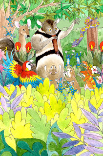
HOORAH! Farfaria is now LIVE... and has published the 2 ebooks that I illustrated. Finally -  the gags been lifted. So without further ado I can now show you what I've been mum about. Between mid September and early February I illustrated, An Armful of Acorns by Adrian Riding and The Greedy Ant Eater by Christine Sawinsky.

 Both books were illustrated using my traditional ink and watercolor technique but with a digital twist. As these were going to be for an ebook app or is it just a book app, each page illustration was constructed of layers of individual illos. For example:  P 7 from An Armful of Acorns, the blue sky is the base layer. The tree is a separate illo and another layer. As is the squirrel and the nuts and the leaves. Each page element is individually inked, painted, scanned, cleaned up in Photoshop and than finally combined into one layered Photoshop file. This way the app developer can make the leaves flutter or the squirrel twirl or acorns spin. These 2 are my first ebook projects. They were a fun creative challenge and it helped that Farfaria was very easy to work with.

Below are my favorite illustration from each book. Both now available on the App Store. 
P-7 from An Armful of Acorns © Farfaria
Filbert is nuts about acorns which lands him in all sorts of predicaments.
To view the cover art or to find out more - click HERE
P-10 from The Greedy Ant Eater © Farfaria
Ambrose clowns around with his nose hose to amuse his friends.
To view my cover art or to find out more - click HERE

Yikes - I don't have an i-Pad!!!!  Yup it's on my to buy list. Needless to say if anyone downloads any of my books, I'd really appreciate it if you would let me know if the squirrel twirls or if the anteater rocks and of course if your kids liked the art etc? Just leave a comment. Thanks!

Thursday, January 26, 2012

Illustration Friday: TWIRL

Long Tailed Dragon - © Diana Ting Delosh - Ink, watercolor, photoshop
A long curlicue tail is fun to TWIRL
Twirl for Illustration Friday

Wednesday, January 25, 2012

Dragons - 1 Sketch to Several Dragons

Dragon  Sketch - © Diana Ting Delosh

I doodled this  dragon with my trusty ball point pen during a TV commercial. The commercials and time limit provide enough distraction so I can ignore any inner critic. I find that I can get started on a few of my back burner projects this way. Helps me get more done without the burnout. This sketch then had to wait it's turn until I had time between assigned work to transfer to paper, ink and paint, but at least the sketch stage was done.

As this Dragon illustration usage was for my Year of the Dragon/Chinese New Year cards as well as a decorative motif on various products I chose not to draw/paint in a back ground. I could add these on with Photoshop, giving me more design options. Leave it plain for a decorative look -great on a T-shirt or a card. Add to the tail to make it longer to wrap around a mug for example. Plop it on a solid background for a card or even my painted starry moonlit scene for a more narrative look. 


Asian Dragon- © Diana Ting Delosh


Long Curlicue Tailed Dragon - © diana Ting Delosh

Starry Night Dragon - © Diana Ting Delosh
You can find my dragons inhabiting my shops at:

HAPPY YEAR OF THE DRAGON!
FYI the Dragon  is supposed to be the luckiest of all the 12 Chinese zodiac animals. The Chinese New Year is celebrated for 15 days. 2 weeks plus 1 day for good luck. The 2012 Dragon Year is celebrated from Jan 23rd to Feb 5th.

Monday, January 2, 2012

My Chicken Licken Illo entry for the SCBWI TDP Illo Award

Chicken Licken (Chicken Little)
© Diana Ting Delosh
Ink and Watercolor

TA DAH! Here is my entry for the 2012 SCBWI Tomie dePaolo Illustration Contest. The winners will be announced very very soon. Keeping my fingers crossed but I'm not holding my breath as the competition is an amazingly talented bunch!

If you'd like to see some of the other entries please go to http://scbwicontest.blogspot.com/. Fellow contestant, SCBWI Houston Illustrator Coordinator, Diandra Mae, has put up an unofficial showcase of the entries. This gallery was created to show off more of the art as the official SCBWI announcement will only show off the winners.

Winners announced on January 9, 2012.
And the winner isn't moi -sigh- back to the drawing board,
The winners can be viewed here

Monday, December 19, 2011

Beary Christmas!

Brown Bear's Christmas Wreath
© Diana Ting Delosh
ink and watercolor.

BEARY CHRISTMAS
and JOY TO ALL!
 

Just thought I'd wish everyone Happy Holidays before things got too hectic around here and I forgot.

Tuesday, December 13, 2011

Vote for...#22!


Howdy Friends - I entered my Snowman - Christmas in a  Greeting Card Design contest: Let it Snow and now the polls are open for voting. Anyone can vote. You don't have to be a member of the GCU community. Voting ends December 18th. Please view and vote for your favorite design by going to this link: http://gcucommunity.com/2011/12/13/design-contest-let-it-snow-time-to-vote/

Hint hint... my design entry is #22 ...wink wink.

Thanks for voting!

Wednesday, December 7, 2011

Illustration Friday - Brigade

SNOWMEN!
Ink & Watercolor
© Diana Ting Delosh
Here's my entry for Illustration Friday - A whole BRIGADE of Snowmen to usher in the winter holiday season. I was working on my motley crew of snowmen sketches when IF posted the word of the week and I thought they fit the prompt.

I created these snowmen for my POD stores*. The arts done -now just need to sneak in the time between assignments to make the illos into  "products". I know I'm a wee behind, at any rate the snowmen will be arriving into my various stores and depending on how you look at it they're either too late for this winter season or too early for next year's. In the meanwhile I hope you liked the preview.

Snowmen will be arriving soon at my *stores: 

Note to self: 2012 resolution #1 - create seasonal art 3-6 months ahead of the season for my POD shops. Give them time to build some SEO and all that other good stuff.

Friday, December 2, 2011

YAY -I Completed PiBoIdMo 2011!

I do solemnly swear that I have faithfully executed 
the PiBoIdMo 30-ideas-in-30-days challenge,
and will, to the best of my ability,
parlay my ideas into picture book manuscripts.

WHEW! - so glad I completed the challenge, although with a dry patch in the middle I almost gave up. All in all even with a bit of creative block it was a lot of fun: reading the daily inspiring posts on Tara's blog, hoping to win a prize here or there. Most of all just having fun and knowing that I'm not the only one muttering PB ideas to myself for the month of November.

Now the work ahead and into 2012 is to flesh out at least 1 of these scribbled ideas into a real PB story - a PB dummy even!

For more info about PIBOIDMO please read or Follow Tara's blog at http://taralazar.wordpress.com/  

Friday, November 18, 2011

M-M-M-M It's a PBDummy!

M-M-M-M CUPCAKES
Scan of my Picture Book Dummy
All art and text © Diana Ting Delosh
Web/Portfolio - dianadelosh.com

Tah Dah - I'm so happy to say it's a DUMMY! I've been working  on this dummy , betwixt and between jobs and life and there were many times that I thought it would never be a cohesive piece.  This 32 page dummy is comprised of 2 finished colored spreads and the balance is loose sketches. I even created some yummy cupcake type for the title. Finally, here it is all put together and in time for my big portfolio review last weekend.

So how was M-M-M-M CUPCAKES PB Dummy Debut? I saw 3 reviewers; 2 editors from small to midsize publishing houses and 1 Art director from a large Big Name Publishing house. 

The Big Name Publishing House Art Director liked how my dummy demonstrated that I had a real sense of how a picture book should flow.  However her imprint was not interested in Concept Stories. 

Editor # 1 was also not looking for picture book illustrators although CB liked my portfolio and told me I could send her ideas and sample art. Sigh. 

However I really seemed to hit it off with editor #2. PG seemed to really like my portfolio and my dummies especially M-M-M-M CUPCAKES. She also really liked concept books as this mid-sized house tends to sell to libraries and schools, hence their lists are school curriculum driven. PG even quickly read through the brief text and gave me a few suggestions and permission to formally submit this proposal after I've made her suggested revisions as well as send other new proposals to her. YAY -very exciting! Keeping fingers crossed!

Note I did not mention the Publishing houses nor the reviewers by names. I have a superstition that if I talk too much about something prematurely I may jinx myself. More importantly though is that this is my experience and yours with the same company and reviewers would be your unique experience based on your work.  This review has convinced me to try a new strategy of picking smaller or midsize publishing houses as they seemed to be more open to acquiring new projects/illustrators. 

FYI: I only show my hard covered dummies in person at reviews, conferences etc. To submit this project as a Picture book proposal, I create a multipage PDF  from the 16 spreads (15 internal spreads plus the cover) that I can easily pop in the mail or even just attach to an e-mail, with cover letters of course. 

Wednesday, November 2, 2011

PiBoIdMo 2011!


Here we go again! I just signed up for PiBoIdMo 2011,  Picture Book Ideas Month at http://taralazar.wordpress.com/. The challenge is to come up with 30 picture book ideas in the month of November (30 days). Just ideas - no outlines etc. -keep it simple and have FUN.

Last year I put my ideas onto index cards. Not sure if I'm using the same low-tech method for 2011. I may just scribble them into my journal and enter them on a running list. My 2010's participation in this challenge resulted in the current dummy that I'm almost finished with. Click HERE if you're curious about that project.