Welcome

Welcome to my blog , The Hare Illustratère. I'll be posting about my art process and journey as an illustrator/author here.

Pages

Showing posts with label self-promotion. Show all posts

Sunday, January 8, 2023

January KidLit Art Postcard


Panda Crack, from picture book dummy, Panda Panda - © Diana Ting Delosh
Ink with brush, Photoshop with Wacom.


Here's my first #kidlitartpostcard and #cbigArtShare for 2023! #KidLitArtPostcard Day is on the first Thursday of each month. Illustrators post their digital postcards on Twitter and Instagram giving art directors, editors and industry professionals a specific day to look. The next KidLitArtPostcard will be on Thursday, February 2 - better get creating.

Last year I committed to designing a different postcard layout for each month. This year I plan on doing the same. The challenge is to create art that you're proud of BUT also work that you can show now. Which means creating personal work on top of commissioned work. Unfortunately, most client work can not be shown until it's published unless you have special permission.

Below is a round up of last years posts. Beginning with Elephant and Meerkat Friends for January  and ending with a Mermaid Melange for December 2022.


Thanks for looking. I hope you enjoyed the show.
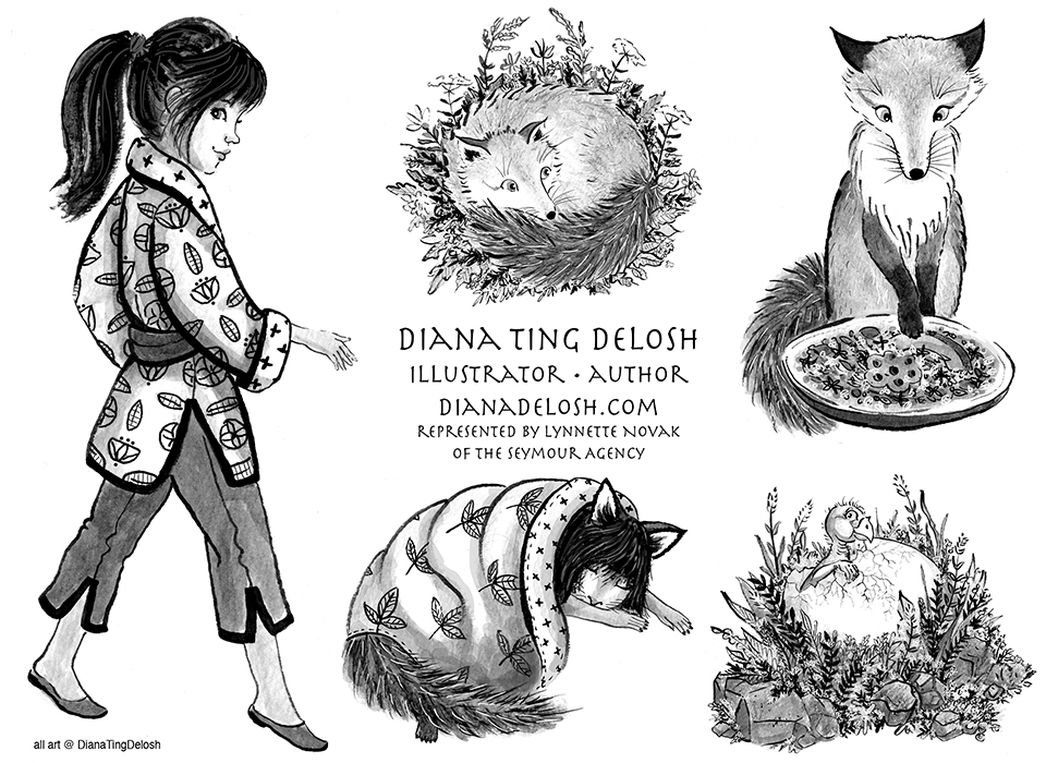


Instagram: @dtdelosh
Post: @dtdelosh

Check out my shops:


Sunday, April 10, 2022

April: KidLitArtPostcard: Kazu

Kazu, Fox girl character © Diana Ting Delosh

One of my  goals for 2022 is to post a #KitLitArtPostcard post every month on Twitter.  Here's my April digital postcard. That means designing 12 different digital postcards for 2022. Which will give me a range of designs to send out to Art Directors and editors when I do an e- mailing.

Rules for myself are: 
• Preferably fresh, recent illustration.
• Has to be an illustration I've never used for a KitLitArtPostcard.
• Post on the Day, the earlier the better.

The pros of creating digital postcards are many.  It's free and you can tailor your design to the recipient. No Printing costs. No stamps. No address labels. No waste. 

The cons: It's harder to get email addresses for art directors and  editors. Hence why #KidLitArtPostcard is such a genius idea for kidlit artists.

#KidLitArtPostcard created by Gina Perry, @ginamarieperry, last spring for illustrators to promote their art on Twitter since the pandemic made snail mailing postcards problematic. Illustrators create a digital postcard and post it on the 1st Thursday of the month on Twitter and now even on Instagram.

My Feb #KidLitArtPostcard Twitter post
Dragon Egg, Mandrake Root © Diana Ting Delosh


twitter: @dtdelosh
Instagram: @dtdelosh


Check out my shops:


Monday, September 26, 2016

2016 Illustration Promotion Pages

One of my favorite pet projects for my local illustrators group, CBIG is to put together the annual Illustration Directories, the COLOR and the BLACK & WHITE to showcase our member illustrators. And if I'm designing the things, I sure as hell going to make sure I have a promo page in both of them. Personally, I think it's a good practice to make your own promo page annually anyway.
2016 Black & White Promo Sheet
The challenge to designing a promo page is deciding which illustrations go on it. Feature one or multiple illos? Definitely only 2016 work. This may sound easy but some years if I'm working on hush, hush projects this could be tricky. I went with three images for my BLACK & WHITE page: an ink and wash, an adult coloring book line art style and a grayscale version of  a hand lettering piece.

2016 Color Promo Sheet
For my Color Promo Page I decided to keep it simple and only one image.

Why should you create a promo page or two? You can add the PDFs to your website for your potential clients to print out. (next on my to-do list) Hand out the print outs to Art Directors & editors you meet at conference one-on-ones or other opportunities. You can also e-mail them as an attachment or give them the link on your website. Share them on your social media sites etc.

YAY! My BOY was selected for the cover of the BLACK & WHITE directory by a vote by the CBIG membership.  Very honored to be amongst my talented colleagues: Stephanie Ruble, Sharon Holm, Mike Ciccotello.


Web/Portfolio: dianadelosh.com
Twitter: @dtdelosh
Group Blog: D2PB

ThumbNailer a book of boxes for your creative process

Monday, September 12, 2016

It's Illustration Self-Promotion time: Postcards


My original plans for this summer was to take a"vacation" away from kidlit art and work on my projects that had been put on the wa-a-a-ay back burner. After all I had just OD'd on kidlit prepping for the SCBWI NJ Conference and I couldn't think of another PB anything. HA!


Postcard for mailing: Front & Back of card
click to see bigger

But wait a moment, I had created a hand out for the  conference.  Seemed like a brilliant idea at the time BUT it meant that after the conference I didn't have a postcard I could just mail off. Drats! Now I'd have to create a postcard for mailing out. I knew which image I wanted to put on the front - my current Fave, Boy meets octopus, the illo that came out of the conference illustrator intensive. But what about the back? I  didn't want it to be too similar to my conference hand out. My solution - create art to to put the front illustration in context. I had always thought of the front illo as a dream or fanstasy scene. Hence my illo of a boy in bed with a book and his cat for the back of card. If you look closely at the book you can read a bit of the title "Twas... It's a nod to the illustrator intensive brief to illustrate a line from Lewis Carroll's poem, Jabberwocky, which begins, "Twas brillag and the slithy toves..."

Conference handout Front & Back of card
click to see bigger

Snoopy -my studio guest.
Ahem - helping me update my mailing labels.
 

About the No Kid Lit Art Vacation and those back burner projects? Well they've moved up a bit on the burners and are simmering nicely. A few have even come to a boil.  You can peek at a few on my ArtHaresWares blog. There's a lot more but they're not ready to share yet.

My posts on the D2PB Blog In case you missed them:
• What I learned when I sprained my ankle: Celebrate the Small Steps
• My NJ SCBWI Conference illustrations: NJ SCBWI 2016 Aproaches

Web/Portfolio: dianadelosh.com
Twitter: @dtdelosh
Group Blog: D2PB

Sunday, July 22, 2012

PumpkinEater Promo Postcard

July2012 Postcard front & Back
Art on Front is © Diana Ting Delosh
Art on Back is from An Armful of Acorns © Farfaria
NOTE: I've smudged out some info out of privacy concerns
  
Opted to try the BIG postcard size for my latest postcard campaign. From what I have read on various sites and have heard from other illustrators/art directors and editors - the Big size stands out amongst all the postcards they receive. At almost double the size of the standard size postcard it had better.  They're just shy of 5.5 x 8.5 inches.

I had these printed via VistaPrint.com and as they were running a sale - even printing in color on both sides did not bust my budget. I must say I'm really pleased with how bright and vivid the colors are. Now postage of course is the 1st class rate so that did tack a bit more to the price. Is it worth it? I hope so, however as I just mailed these out it's too early to say. I am keeping my fingers crossed that they get noticed and pinned to that coveted bulletin board. I can even dream that they lead to an actual assignment.

Any other news? Well lots but unfortunately it's all still hush hush.

Wednesday, April 13, 2011

Tah Dah - April 2011 Self-Promo Postcard!

Skunk, Bear, Bunny April 2011 self-promo postcard design
Ink & Watercolor © Diana Ting Delosh
TA DAH!  My 2011 self-promo postcard are ready to go out into the world... whew!

Normally I do 3 postcard campaigns a year but last year I never got around to doing my usual fall campaign. Fall 2010 I had a series of unfortunate events; beginning with my G4 crashing and dying a messy and untimely death - mid project of course. Is there ever an opportune time for computers to die? My latest mailing list was a casualty along with a whole bunch of files I had never gotten around to copying to my external hard drive or the new computer.  Luckily I did have the new computer in studio. Needless to say doing the 2010 fall  postcard campaign meant redoing the list. (Note to self: copy current labels/list files to the Lacie). Just the thought of the task put me in full procrastination mode - forget about any other disasters and dramas that occurred last fall. Suffice to say the 2010 Fall postcards did not go out.

Is a postcard campaign even relevant in 2011? Decided yes - I should quit stalling. While I don't get an assignment with everyone of my mailings - I do usually get a positive response. So back to trying to do 3 mailings a year.

What design to use? A totally new one or an image that's my current fave? I never know what to pick. The image is of crucial importance after all that's the one that will make them click on your website or not. Considered doing a new design until I read that postcard postage rates will go up April 17th - from 28¢ to 29¢! That decided it. Use a current fave and get off my butt and send it to Vistaprint.com.  Decided to cut my list in half for a  lean focused campaign. The printed cards arrived - early. Thanks Vista! My labels are done! Just need to stick on address labels and stamps and Voila they'll be out and on their way before April 17th! Whew - now that wasn't too bad!

Tuesday, March 30, 2010

Spring 2010 Postcard

Sunflower Friends Spring 2010 Postcard Design
(my real e-mail and phone number is on the card - just removed them for purpose of showing the design on the blog)
© Diana Ting Delosh
Ink and watercolor

This is my spring 2010 self-promotion postcard. The hardest thing is deciding what to pick as your postcard image. Originally I had wanted to do a totally new image for the card - maybe a fantasy image - or bunnies for Easter etc. However my mind kept turning back to this piece in my portfolio... so Sunflower Friends it is. Just as well as I need to get these cards mailed before the postal rates go up in May. Not sure if the postcard stamps are affected but it's better to err on the safe side.

Just heard from Vistaprint that they've been shipped and I should get them soon. Already bought the stamps. Last year, the post office had run out of postcards stamps in April so this year I bought them early. Now I just need to update my mailing list, print out the labels and I'll be ready to get them out before the Mother's day deadline!

Other news - My blog article, Why an Artist Should Have a Blog, is posted on Greeting Card Designer as part of Kate Harper's Social Media in March series. Please Hop over and read. In fact browse through her blog it's full of useful info for all types of artists/illustrators.

Wednesday, December 2, 2009

Fall Bear Postcard, CBIG Review, etc.

Bear Walks in the Woods
© Diana Ting Delosh
Ink & Watercolor, portfolio & used as fall 209 postcard.
This is the illustration I used for my latest postcard self-promo campaign - just sent off aproximately 220 postcards. Needless to say I'm keeping my fingers crossed that it will land me a nice juicy assignment or two.

I can't believe it's already December! Yikes where did the time go? What have I been up to? I meant to be better at blogging but it seems November has gone by with nary a peep from me. Well I've been busy with CBIG - specifically the November review and getting the above postcard campaign out - not to mention the usual art biz and family/Thanksgiving stuff. So now that I've fully digested November -I guess it's time to dish.

My CBIG Portfolio reviews with 2 art directors. I'm only using initials out of respect for their privacy and because this is proprietary CBIG info. I opted to see MR from HC a giant publishing house, whose Children's division published infant to YA books and RP from SP, a mid sized publisher whose juvenile division only published picture books. In general the reviews went well - both liked my animals. I also showed 2 dummies but as art only.

MR/HC: wanted to see more angles, varied perspective, view points etc. I sat opposite her as she reviewed my portfolio and as I viewed my work upside down - this flaw was obvious to me. Note to self - look at my portfolio upside down more frequently. Luckily for me 1 of my recent dummies demonstrated the varied persoectives and viewpoints she craved - whew. She also wanted me to create more oomph, drama with my illustrations. Yes - she liked my latest Bear series (the above is 1 of 3 new bear illustrations) YAY they were worth working on late into the night!

RP/SP: liked my animals a lot as well as my dummies. Unfortunately it is just a matter of everything aligning: right story/right art/right time. She also liked my B&W work and some of my book cover samples in my portfolio - she thought this might be something I could develop further. Her company is only doing picture books but many other publishing houses have middle grade & YA dept (and mid-grade/YA market is doing very well right now - maybe more opportunities).

Yup - got some work to do. Make sure my portfolio reflects the fact that I do different perspectives and view points, shows narrative, drama, etc. Create more Jacket & interior spot art to go after the mid grade/YA market. Lastly, write a wonderful picture book manuscript for my animals so next year I can show a dummy as both art and story.